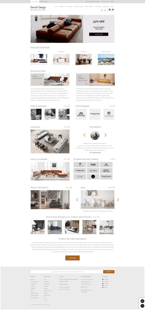
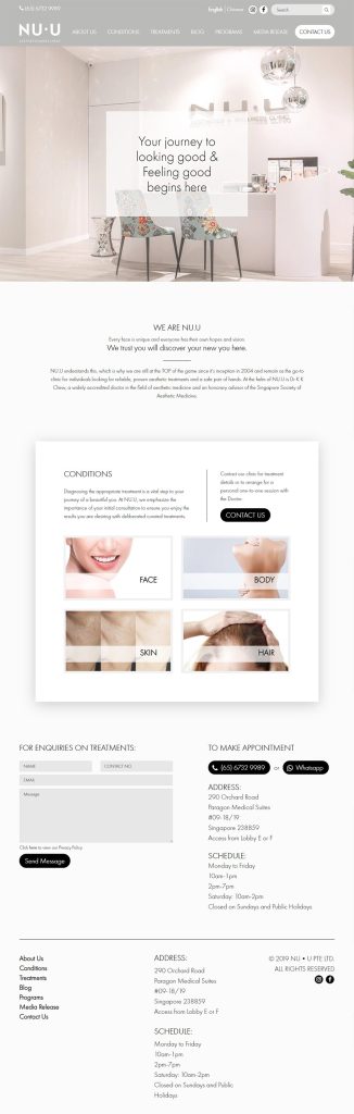
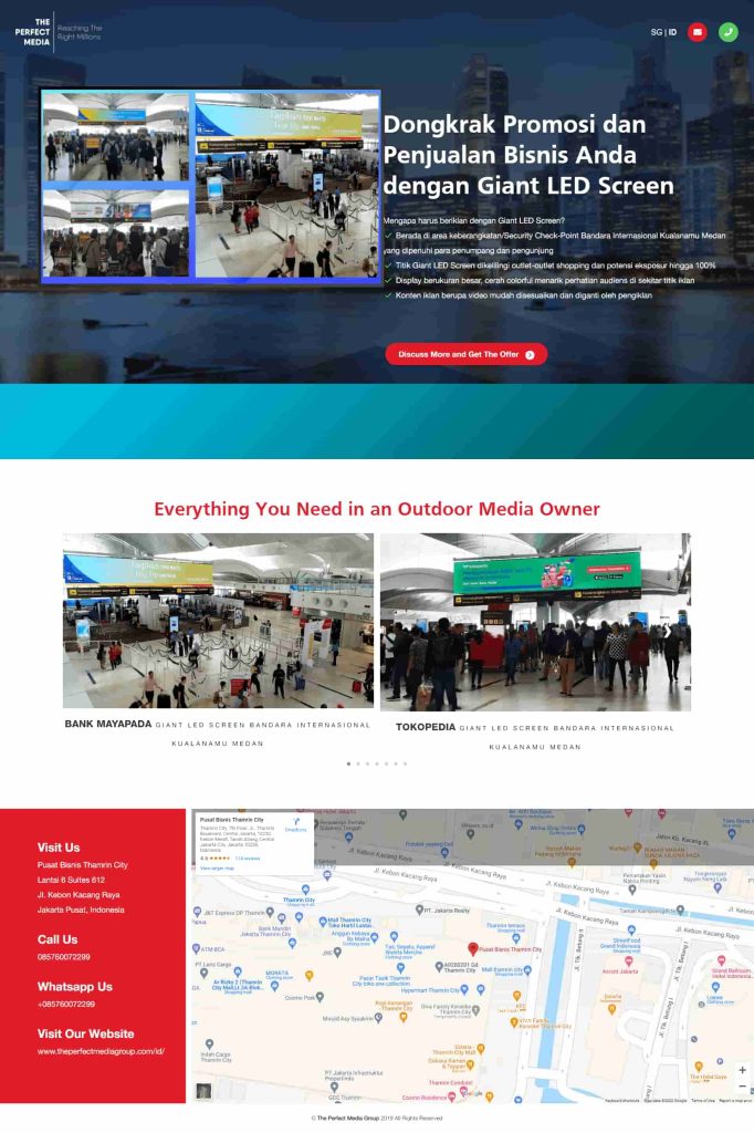
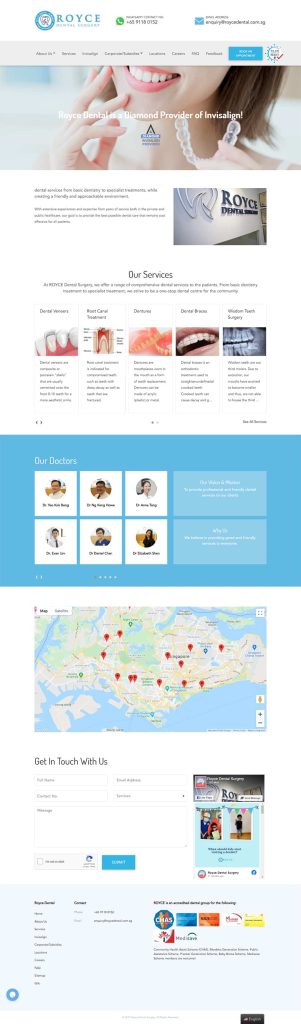
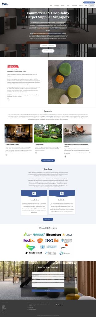
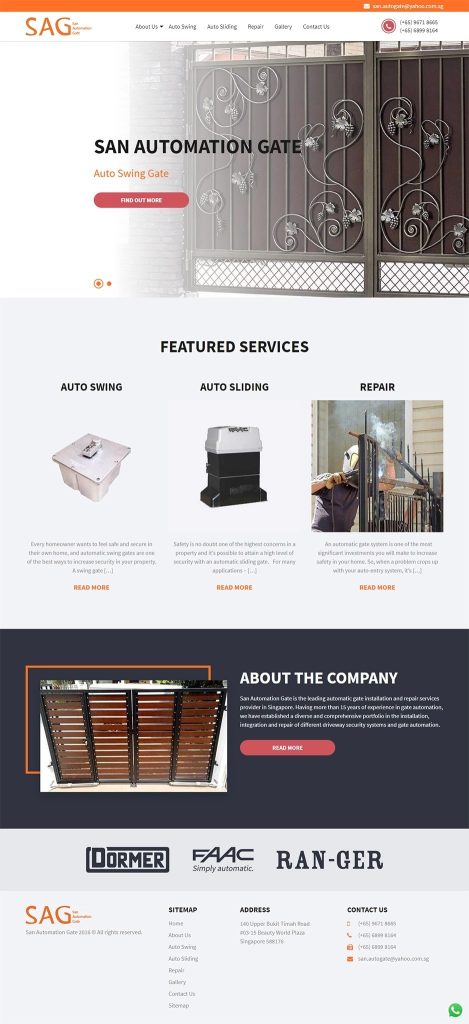
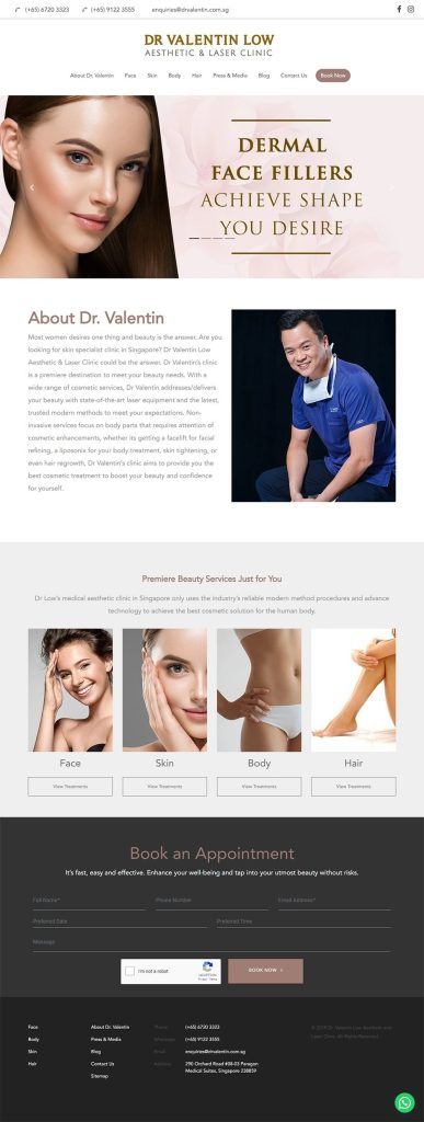
Create a good first impression for your potential customers. With our team of professional website designer and developers, our development services are both aesthetically pleasing and conversion driven.
4 Different Types of Web Pages
Fixed
The layout and proportion of the website remain the same, regardless of the user’s screen size.
Responsive
The entire website, including various elements, are adjusted according to the size of the screen.
Fluid/Liquid
The proportion of the elements remains the same, but the layout will be adjusted according to the size of the screen.
Adaptive
Multiple layouts for various screen sizes will be pre-created. The user’s device will select a version of the layout that fits the device’s screen size.
Beautiful Layout
With an expert team of website designer and developers , we are confident that we can help you ensure all visitors to have the optimal user experience and appealing aesthetics regardless of device type – be it desktop, mobile or tablet.
SEO-Friendly
As a professional digital marketing agency that specialises in SEO, our development team is trained to develop your website with the latest and best Google practices.
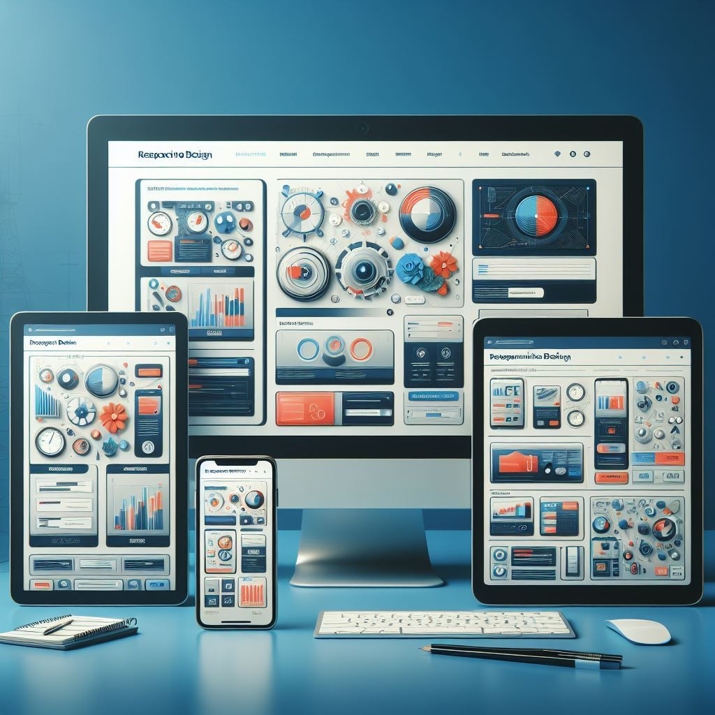
Responsive Design
Your website designs automatically fit nicely into any device – be it desktop, mobile or tablet. With people using multiple devices nowadays, it is important for the layout to be aesthetically pleasing on all devices to reduce your site’s bounce rate.
Our Portfolio
Ready to Elevate your Business to the Next Level?
Discover how we can help you to achieve your business goals through digital marketing in just 30 minutes.